ARD 406 – Heroes & Heroines Evaluation

Leave a comment

Part A:


My pattern of learning for Heroes and Heroines started with my researching a number of designers ad artists. This was a basic task designed to give us a little head start, the idea being that, once we’d got our foot in the door, we’d start to branch out and include our own views and designs/artworks that we personally liked. I think this was very successful in general – I started delving into areas that genuinely interested me. This started a treadmill – I would start researching those that interested me, and then that would lead to the discovery of other artists and suchlike whom I found inspirational.

Part B


1.1 How is your research contributing to your ideas for your ability to conceive ideas for your assignments?


Generally, I would just include the link as to where I found the research in my work folders and write about the information that interested me. With the blog, however, I engaged in research a lot more which naturally means that I gained more inspiration. There were a number of artists that I did not find interesting, but I tried to do the same level of research for all artists. I soon started to expand my blog with updates to my work at university, together with designers and suchlike that I actually find very inspirational. I think writing publicly and in depth about my views and research is more fulfilling than simply giving research to my tutors for them to mark. Getting feedback and comments from my classmates on the blog was rewarding and it gave a new level of professional interaction.


1.2 Reflect on and consider the use of visual language and expression in the communication of your ideas on paper?


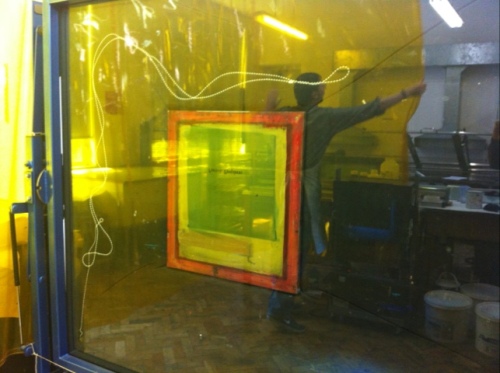
I communicated visually in a number of different ways this term. I worked with various aims  for the different projects, and working with different tools. Methods ranged from screen printing to engraving. I think this range of different means that all end with the same result – in essence – of communicating my views with a wider audience. I preferred working digitally overall – but in particular I liked the way that I managed to combine new and old methods of working together.


1.3 What has been the most significant learning experience for you with this assignment? 


My most significant improvements have been with my breadth of understanding of multimedia related software. This term, I really got involved with using more software, learning new skills, and creating new projects. I got to grips properly with Illustrator, Photoshop and After Effects. I really enjoy working creatively with software, so jumped at the chance to go to the tutorials that we had earlier in the year, in which Dan took us through the basic principles.

Final Selection – Danny Yount

Leave a comment

Danny Yount is an internationally recognized graphic designer for his work in feature film and mainstream television titles.


As a self-taught designer, Danny Yount learned everything he knows the hard way. It was the work of Kyle Cooper that lead him in the direction of main title design.

“It wasn’t until I heard about what Kyle Cooper was doing with Imaginary Forces that I was able to get a clear sense of what I wanted to do,” Danny told Desktop in an interview, “From that point on I made it my goal to design main titles. To me it was like gravity – it seemed to be the most logical thing to do. I spent a year building a reel and refining my skills.”

Yount is now one of today’s top main title designers for film and television working with Cooper at one of the most prestigious main title firms in the industry: Prologue.

Before Prologue, Yount served as a creative director at Digital Kitchen where he designed the Emmy award-winning main title for Six Feet Under. His main title for The Grid was nominated for an Emmy.

His 1960’s-style animated main title sequence for KISS KISS BANG BANG calls into mind the best work of main title design legend Saul Bass and was nominated for an AD&D award. His most recent work includes the visually spectacular main title sequences for both Sherlock Holmes 1 & 2, Tron and Iron Man 2.


I came across an interesting interview on the website “The art of VFX” in which the interviewers investigate the work that Yount and his team worked on for Iron Man 2.


They were responsible for all the CGI and computer effects that were in Stark’s laboratory. In the example picture below, he explains,

“Ilya Abulhanov and Clarisa Valdez designed all the screens and directed a team of terrific animators and designers to execute the many detailed and complex interactions and data. Daniel Kloehn and Takayuki Sato spent countless hours animating the insanely detailed interactive components. It was definitely a labor of love – and fear – but mostly love.”


One of the most challenging scenes was with the hologram city scene in which Tony explains about his proposed development. Paul Mitchel was the designer in charge of the team that lead this sequence. He explains, “The Expo hologram sequence posed a number of issues both technically and artistically. Artistically we had to handle a lot of detailed visual information on screen at one time, so we had to find the balance between the right level of complexity verses too much confusion. We needed to make sure Tony wasn’t overwhelmed by the information presented to him. We also had to make sure we enhanced his performance with holograms matching his eye line and arms reach.

Technically the challenges were getting this long sequence to feel like one coherent piece and getting it rendered for our weekly reviews with Marvel, so it took a long time to finalize the subtleties in each shot. Getting the holographic look right and consistent was a challenge as it needed to feel like the same hologram in the wide and close up shots, each shot had it’s own issues which effected the light and transparency of the hologram.”


After the stress of Iron Man, there was no chance of a rest with the subsequent phenomenally successful Sherlock Holmes movies being another creative challenge. This time, the challenge was with Watery cobblestone logos and longitudinal linotype layer. Danny explains how they became involved with the movie. “ I got a call from director Guy Ritchie while he was in the middle stages of principal photography. He liked what we made for RockNRolla and asked us to consider something good for Sherlock Holmes. We were sent a script and got very excited about it after realizing the more edgy and fun interpretation of the classic character of Holmes. So Ilya Abulhanov and myself made a couple of ideas (examples 1a & 1b).

This slideshow requires JavaScript.

“I was invited to fly out to present them at one of the sets in London and see some of the film, so I had a very strong sense after that of where they wanted to go visually. The brief I was given was to do a live action shoot that involved a lot of newspaper headlines from the late 1800′s, which would give a little history to the early beginnings of Holmes and Watson and lead into the first scene of the film following the last headline on top of a stack of newspapers laid at the doorstep. We also wanted to show part of the printing process of that time period using the linotype machine and wood block type headline compositions.”

This slideshow requires JavaScript.

As with Iron Man 2, the team also worked on the VFX scene within the movie. They were repressible for the Hallucination scene, in which Sherlock has a vision of Lord Blackwood ‘s crimes and the methods with with he committed them.

This slideshow requires JavaScript.


Ref:  http://www.artofvfx.com/?p=369

Ref:  http://www.watchthetitles.com/designers/Danny_Yount

Ref:  http://www.artofthetitle.com/2010/01/21/sherlock-holmes/


Wood Engraving

5 Comments

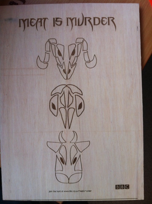
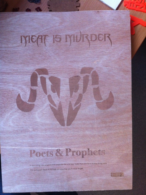
I worked with wood engraving today in the Creative Industries building. These are a few of my final pieces.

20120510-130037.jpg

20120510-130048.jpg

Print

Leave a comment

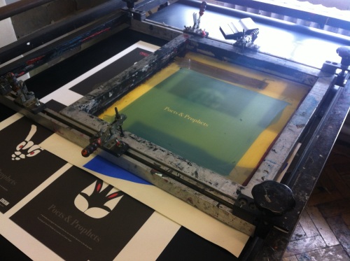
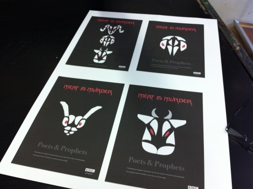
I worked in the print workshop today, adding the finishing touches to my final poster design. I’d decided to print the posters on a quality Matt paper, and then add a hand varnish using traditional methods. I’d wanted a certain part of the text to stand out, hence using Matt rather than gloss paper. I’m quite pleased with the end result, and look forward doing some more experimenting in the following days.

20120509-140153.jpg

20120509-140210.jpg

20120509-120129.jpg